Summary
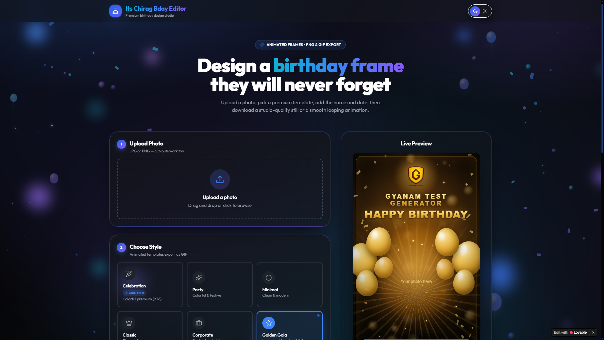
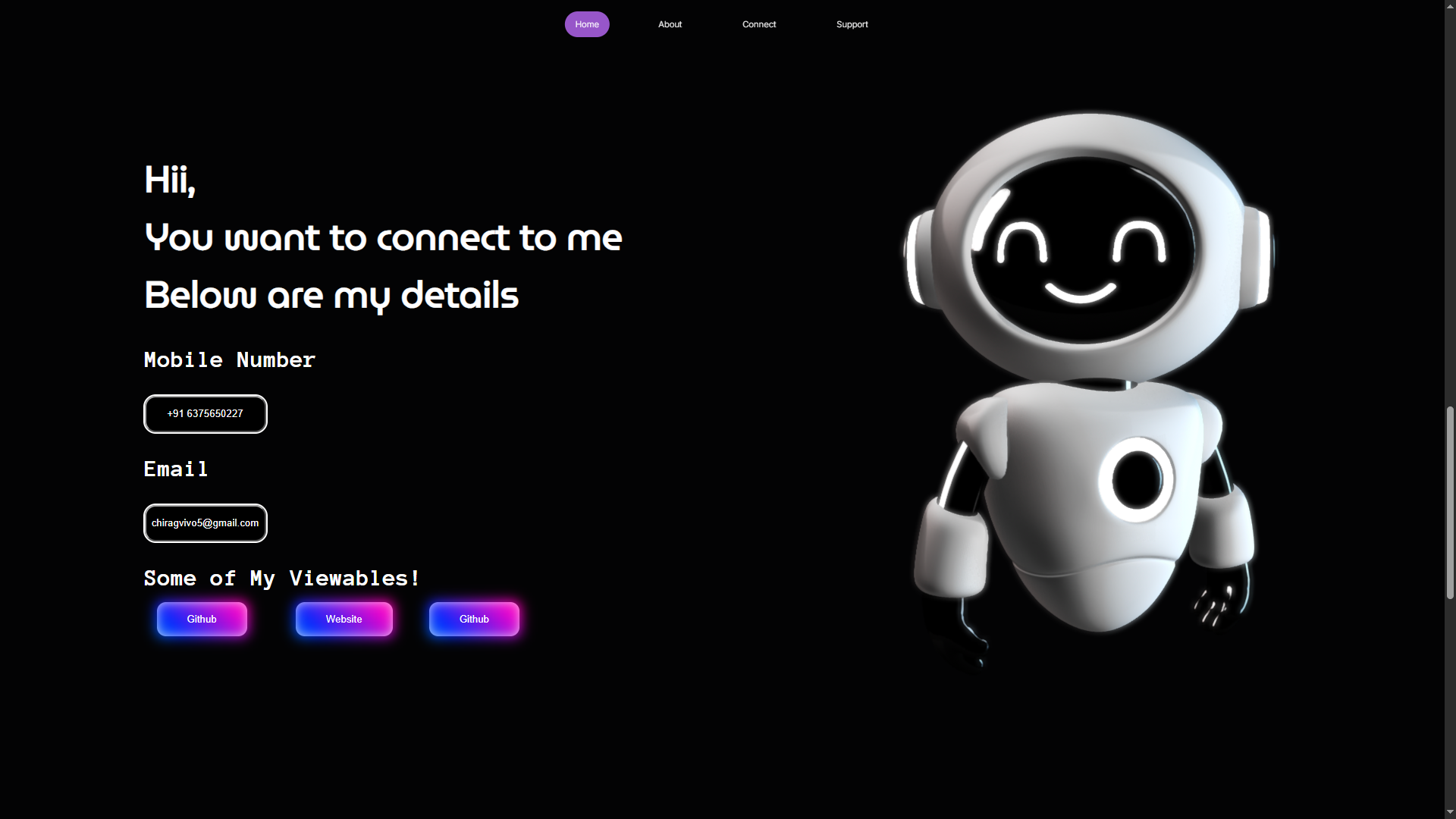
Before this portfolio existed, I built a smaller site by hand to understand spacing, type scale and responsive behaviour without a framework doing it for me.
Visit the live projectWhy I built it
Component libraries make good layouts easy to assemble and easy to misunderstand. I wanted to write the CSS myself so I would know why a section felt right or wrong.
Process
I started with a type scale and a spacing scale on paper, then built sections against them instead of adjusting values per component.
Every breakpoint was designed rather than inherited — the mobile layout is a different composition, not a narrower desktop one.
What carried forward
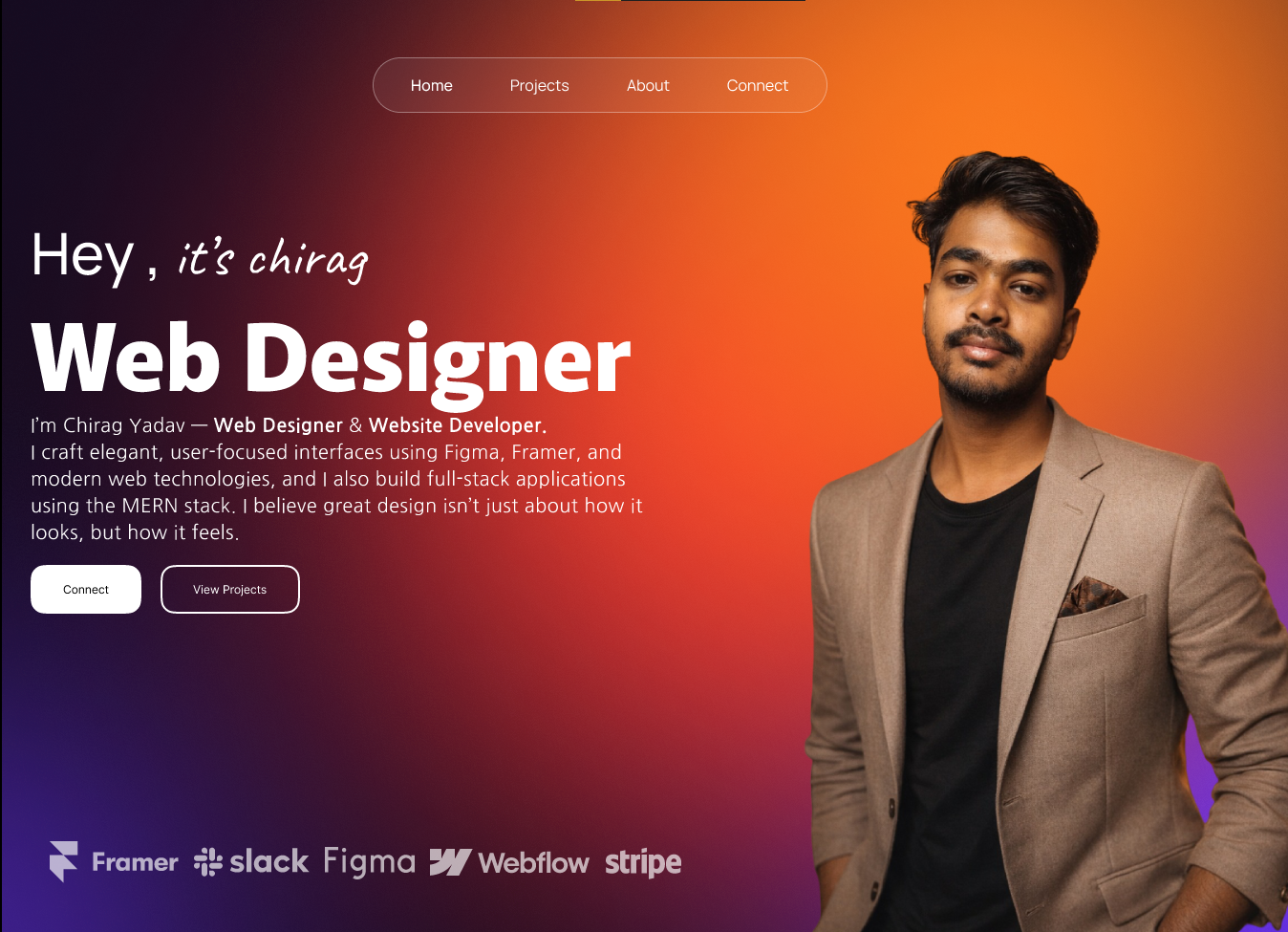
The habit of defining a system first. Nearly every decision in this current portfolio — spacing rhythm, restraint with colour, one accent — started as a lesson from that build.
It also taught me how quickly small inconsistencies in spacing read as amateur, even when nobody can name what is wrong.